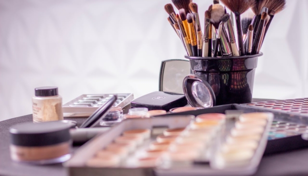
Corporate visual identity: Raj Lepote (Paradise of Beauty)
Graphic Design

In the dissertation, I have examined the elements of corporate identity, presented them, and applied them for the future company Raj lepote. This will enable the company to enter the market with a good visual image.
The aim is to find out what we must pay attention to and how to introduce the company and its message to the customer that will establish a bond of trust with them.
Raj lepote is a new company, and it has not yet made its appearance on the market, that is why a good corporate identity is crucial for the next step.
With that, we show the market that we are much more professional and efficient, and the costumers will find it easier to remember the brand, if it is attractive and consistent from the start on.
I have divided the dissertation into two parts – theoretical and practical. In the theoretical part of the dissertation, I have determined the term corporate identity, and the elements that it includes. I have researched what corporate identity is, and what its elements are, such as logo, colors, typography and press material.
I have used this knowledge in practice. Good formed corporate identity requires a thorough market analysis in Slovenia and in foreign countries. Based on that, the name of the company also changed from Lepotni salon N to Raj lepote.
I have researched some good and some bad cases and have learned what works and what can be improved.
In the practical part of the dissertation, I have designed the corporate identity for the future company Raj lepote and designed the logo with other design elements. I presented the process of making a logo, and explained my choices for shapes, colors and typography as well as their meaning.
This was the most important part, as the logo is the element that represents the company the most. It is usually the first element that costumers notice, makes the biggest impression on them and appears on all the printings and promotional material.
Then I implemented the logo and the rest of the elements on the business card and printed matter. After that, I designed the rest of the printings that would benefit the company – a price list and a gift certificate.
I also added promotional material and a uniform for workers. I have finished with the promotion on social media.